Cavematty's Sketchbook
23 November 2019
Dragon Prince Season 3 is out now on Netflix!
I know blogs are old news. But I am feeling like an old man ever since I became a dad, so I’m going to embrace it. Bring back the blog I say! I mainly update on Instagram, but I’d like to continue to write longer rambles on here. It’s kinda therapeutic and cathartic even if it’s just for me.
What’s not old news though? Dragon Prince Season 3!
It just went live on Netflix so go check it out.
For those of you that didn't know (because I havn't posted on here in forever...) working on The Dragon Prince was a real journey for me. I started with development. Then I was Lead BG artist, designing sets and painting mattes while also supervising other BG artists and providing block-ins or paint overs for them. By Season 3 the original art director, Edison Yan, had moved on and I jointly took over his role. It was my first time officially supervising a team, and what a fantastic show to do it on.
I’ve added a few pieces of art from Season One to the project page on my website, and I’ll keep updating it.
http://www.cavematty.com/#/dpr/
Check it out, and check out Season 3 - it’s bigger, grander and more ambitious than the first two seasons combined. But it’s got a lot of heart. We put a lot into it and we are really proud of it being released into the wild at long last!
09 November 2016
I'm Talking to the Man in the Mirror!
There are those times as an artist where you really wonder what and why to draw at all. Instagram, Facebook, Tumblr, Twitter, Artstation; every avenue online is full of quality work created by an ever increasingly visible plethora of artists. It can be disheartening, and it can feel a little like it has all been done before. Artist Matt Rhodes once wrote a blog post that went viral, titled "I think the internet broke my brain.", detailing how the overexposure to art made him feel much the same way. When you've already been in photoshop all day at work making something someone else needs, but you still want to create something for yourself. When you sit down to do it, a stubborn voice in the back of your mind sometimes says:
"Seen it."
"Jaime Jones already did a better one."
"Vance Kovacs nailed that 8 years ago."
So when I recently hit a slump like that I thought about wise words I'd heard:
"Be authentic. Authenticity is more appealing than peculiarity."
"Do something you love and your love will come through in the work."
But after years of trying to guess what art directors are looking for and divining what clients don't even know they want; after years of striving to make your art comparable to your heroes work, it can be hard to even remember what you want to draw for yourself. My friend Aaron Beck recently posted a chronological timeline of his art all the way through his childhood up to the present day. It was super inspiring to see that his younger self was indeed interested in drawing much the same things as he makes his living doing now. Which made me think back to my childhood.
The first thought that really came to mind: Demons climbing out of mirrors.
That's right. There was a period during my early teens when I would draw them over and over, in the back of my maths books, in the margins of exam papers. While I don't have any of those images on hand to post, I thought I would create a new image in the same vein.
I hope you enjoy it.
Matt Rhodes' post: "I think the internet broke my brain.".
Aaron Beck's Instagram retrospective starts here at age 4.
27 October 2016
Resistant Virus
This was a little piece I created for some friends of mine, Silver and Ashley. They have embarked on an ambitious project for halloween this year. They are trying to get together a huge posse for a 'Thriller' flash mob at Robson Square in downtown Vancouver, BC. If you like to dance, or just like to leave the house without pokemon on the agenda, drop by on Monday night to check it out. You can learn the dance moves on their instagram page which you can find here:
Resistant Virus on Instagram.
The art is used for a parallax header on their website, and features characters and the title block from an ambitious episodic Silver shot a few years back. You can watch that on their website too.
Resistant Virus on Instagram.
The art is used for a parallax header on their website, and features characters and the title block from an ambitious episodic Silver shot a few years back. You can watch that on their website too.
16 April 2016
Antonio 'Bigfoot' Silva
Bigfoot is a huge specimen who has to cut weight to fit under the upper limit of the heaviest weight class in the UFC. his large size and distinct look are at least partially due to a tumor putting pressure on his pituitary gland which caused an overproduction of growth hormone. This causes the hands, feet and face to grow larger than usual. There have been many prominent figures with a similar tumor and the proportions that come with it. Among them wrestling and film star Andre the giant, 7'2" Korean fighter Choi Hong-man and motivational speaker Anthony Robbins.
Bigfoot has been in some amazing wars, heavyweights with their heavy hands punishing each other round after round without stopping. The bloody battle with kiwi star Mark Hunt springs to mind. Thanks for all the amazing fights!
Other fighter caricatures:
15 April 2016
Give me back my Preschusss!
Here's one I did a while back for the rematch between former UFC champion Renan Barao and the man who dethroned him. Barao had been on a tremendous tear, unbeaten for nearly 10 years. Then he met TJ Dillishaw who had the perfect skillset and a very specific game plan to completely shut down Barao and dominate the fight.
It's hard for a successful veteran of any skill to reinvent themselves on short notice. When they met again a year later it went much the same way as many had expected it would.
TJ remains one of my favourite fighters to watch due to his unusual stance switching style and aggressive presence.
Other UFC caricatures:
'Cardio' Cain Velasquez
Nick Diaz
Renan Barao on Wikipedia
TJ Dillishaw on Wikipedia
01 April 2016
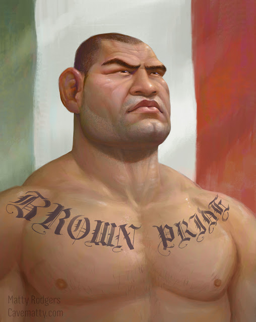
Cardio Cain Caracature
Here's one of 'Cardio' Cain Velasquez. He has a great look with the feel of a predator, something in the rounded lines of his face making me think of a bull terrier or a shark.
Despite his distinct look and intimidating face he was really tricky to capture. He has many strong features; the cauliflower ears, the scar tissue around the brows, the strong jaw, a rounded feeling to the bones of the skull. Yet these features are shared by other fighters, especially those in the heavier weight classes. I couldn't really find any one feature that defined him, and exaggerating too much often looked good but it quickly began to look like another fighter.
Ultimately this one ended up closer to a straight portrait because of the difficulties I had. I'm happy though, because I believe I captured the likeness and that predator feeling!
30 March 2016
Nick Diaz Caricature
Some of those who know me personally will know I've been following the UFC for a while now. Yes, I know that seems odd, a lanky, arty type who likes watching cagefighting? Well yes, it's true. I love it.
With my newfound interest in caricature I noticed some interesting faces in the sport. Years of combat results in crooked noses, buildups of scar tissue around the brow and hard lumpy ears from all the wrestling. Add to this the pronounced, animalistic look of the mouth once there is a mouthguard in and you've got some pretty amazing faces that all share some common traits. Possibly there is also an underlying genetic component defined by testosterone levels, or functionality for fighting. Whatever it is, I find it fascinating. So I decided to draw a couple of them.
Here is the first fighter caricature - Nick Diaz.
Nick Diaz on Wikipedia
29 March 2016
Star Wars Caricature
Now that I spend a lot of my daytime hours working on environments, I've taken to working on my figure work in the evenings to keep things interesting. I watched some tutorials and sketched a whole bunch of naked people. With a growing stack of life drawings gathering dust in a wardrobe I wanted to start applying the learning to create some new things.
I developed an interest in caricature when I met Gil Rimmer. He was working for the same company at the time, albeit on a different show. I really liked the clear, bold statements he made with his art and I became curious to try out caricature for myself.
My first attempt came with Secret Santa at work. From the hat, I pulled the name of a production coordinator who is a huge star wars fanboy. So for his present he got this painting, along with the note: "For Deacon. In the Cantina or the bedroom, he always fires first".
It was created super fast and is far from perfect. I was happy with my first attempt and I really enjoyed doing it which made me want to keep going and create some more...
You can see Gil Rimmer's impressive animation portfolio here.
If you want to work on your own figure work, the tutorials I have been watching are available for free on proko.com. Stan Prokopenko does a fantastic job of simplifying the process; explaining the thinking behind the learning and keeping a great sense of humour throughout. I highly recommend his videos, and watching them in the order that he suggests here.
22 August 2015
Hey guys,
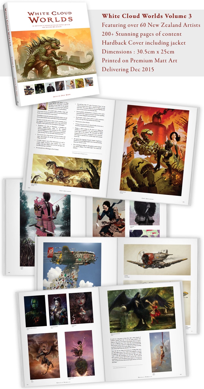
I have some exciting news to share. WCW Volume 3 is coming! The art has been submitted and vetted and the layouts are done. This is the biggest, baddest volume yet! Paul and the team have decided to launch this one through Kickstarter. The book has been self funded every time, but with the added size and therefore costs involved this time the team are looking to get the fans in on the goods a little earlier.
This is probably the cheapest you will be able to purchase the book, I will be buying a few through here as Christmas gifts (love you mom!). There are also a heap of purchasing options, including a set of all three books, some copies of Volume 3 bundled with prints, original art and even custom portraits from Paul Tobin himself. If you want to get a copy of the new volume, this is a really good time to do so! The bundled options are selling out fast though so go have a looky!
I've got a couple of pages in there again, and there is a tease of a new piece I did if you scroll down the kickstarter page (hint: watch out for the cowboy image...).
Please share the kickstarter with any you might think are intereseted! Here's the link:
02 April 2015
Sketch Dailies!
You may well have noticed a tendency towards environments and landscapes in my work in general. Recently though I've taken part in a few of the daily topics posted to the character focused twitter group Sketch Dailies. Here are a couple of the better ones!
If you want to follow me on twitter you can find me here:
https://twitter.com/Cavematty
If you want to follow me on twitter you can find me here:
https://twitter.com/Cavematty
"Kraken" |
"Dick Tracey" done in the style of J C Leyendecker. |
"Scarecrow" - I was really focusing on colour transitions in this sketch. |
Subscribe to:
Posts (Atom)